A clinic website
built for patients.
We rebuilt Union Klinika's website around the things a patient actually needs: services, doctors, trust, useful information and a clear path to appointment.
Maximum clarity.
Without an
oversized build.
The goal was to improve patient interaction while working within a limited website budget.
We took a phased approach: modernise the visual language, make navigation more logical, make doctors and services easier to understand and reduce friction on the way to an appointment. The website became the destination that paid acquisition could confidently send patients to.
Not a mockup.
The website we built.
These are real project visuals from the original Union Klinika website case — desktop composition, the page system and mobile patient journeys.
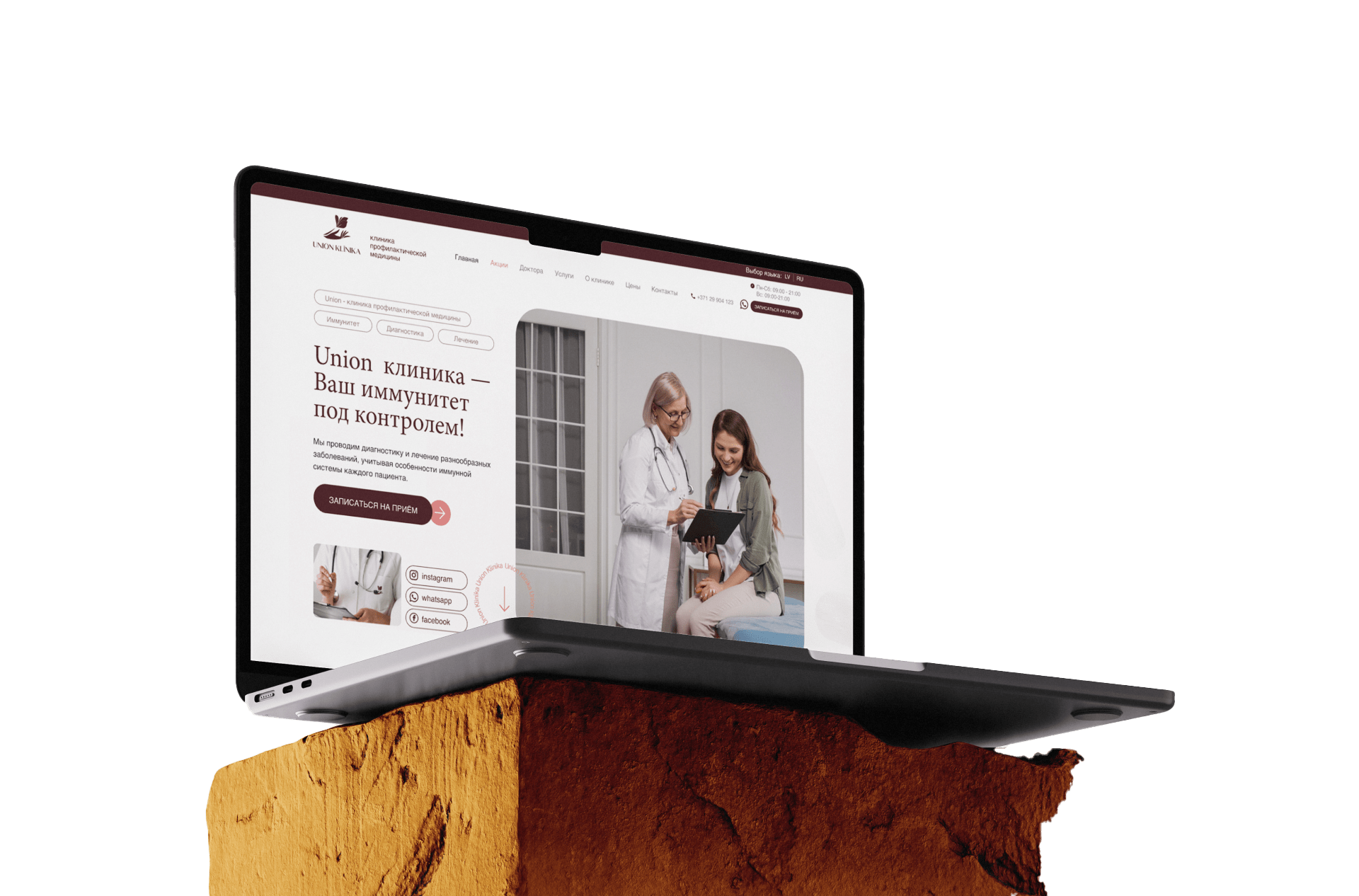
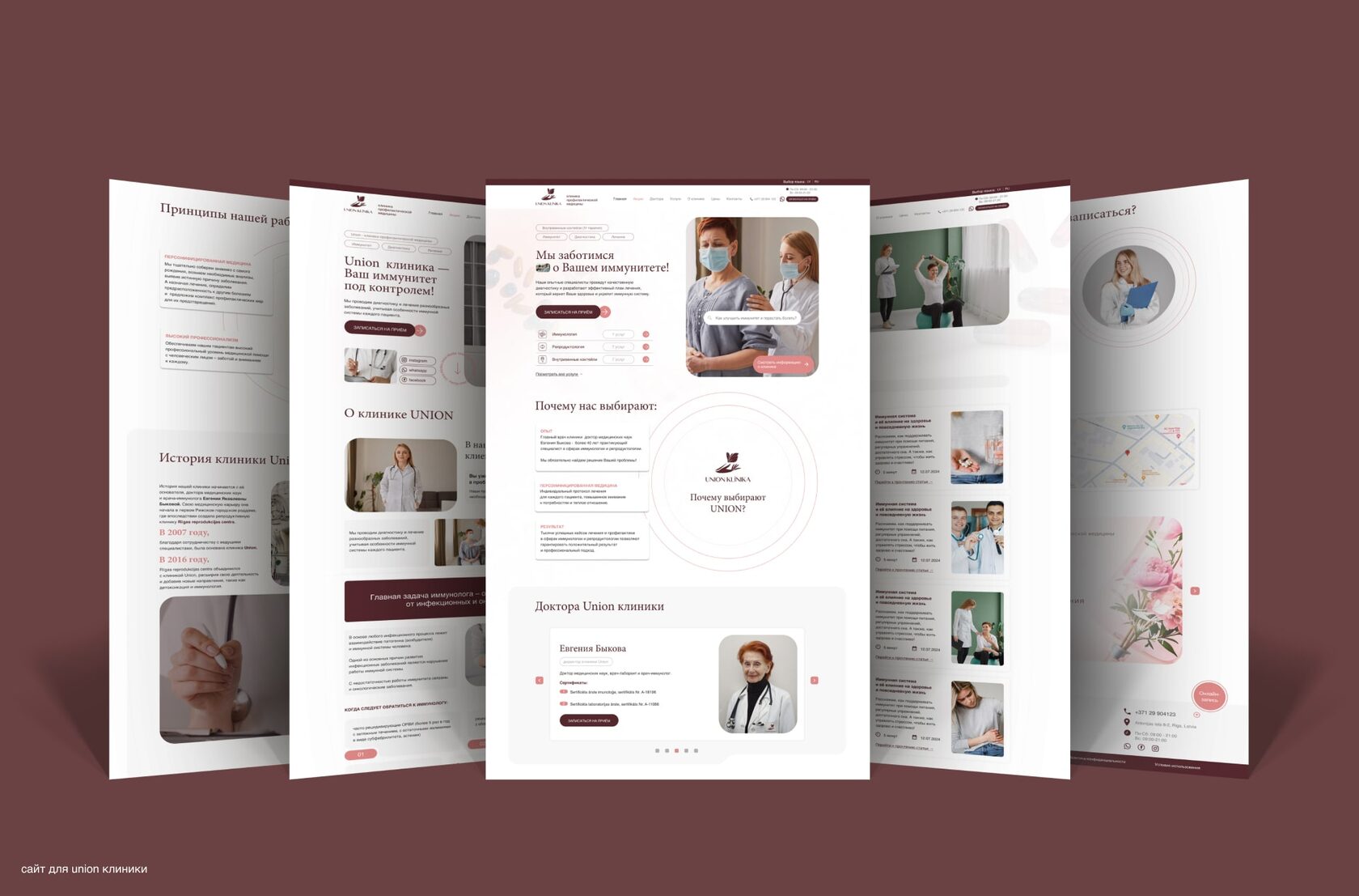
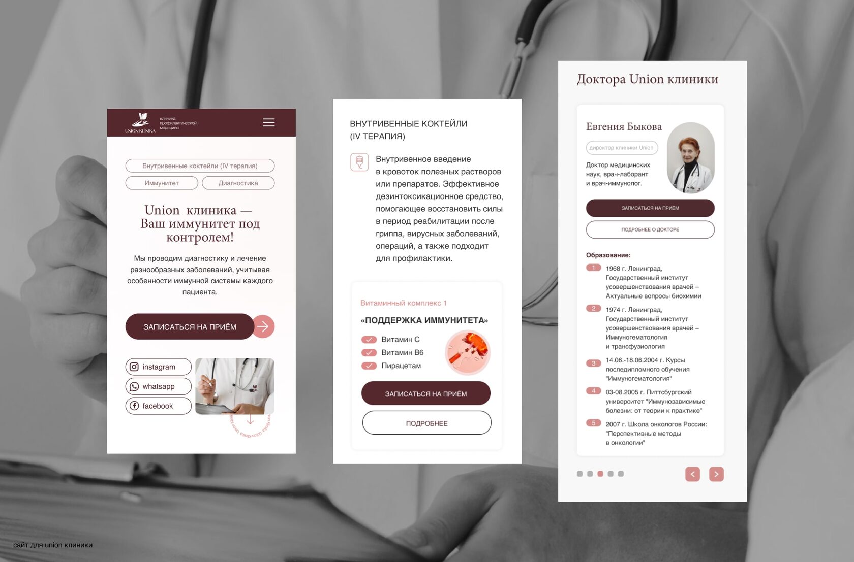
Original project presentation visuals. The live website has evolved since the project was first published.
Design was only
one part of it.
From question
to appointment.
A medical website has to help a person make a decision, not just look polished.
The website is
still doing its job.
The current Union Klinika website remains live. Its content has changed over time, but the project continues to function as the clinic's patient-facing digital destination.
OPEN UNIONKLINIKA.LV ↗